This may not be the most exciting packaging for workout gear but it does show many of the different ways to use the product. It is also in a color that will pop out from an aisle that you look at. Maybe a way to improve this packaging would be to make the person on the white background a different color because sometimes white can be a little boring for negative space. This packaging is mainly focusing on a younger audience that like to work out. Hence, why they put a younger person in to illustrate how the product works. This packaging helps to make the product a little bit more appealing but not enough for me to buy it.


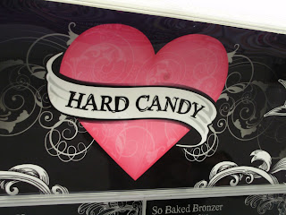

The next four pictures are of the make-up brands Hard Candy & Revlon. The first three are the Hard Candy and the last picture is of Revlon. The Hard Candy brand appeals to a pre-teen to young adult audience because of their kind of script-feel to the lettering almost a goth/graffiti feel. I hardly wear make-up but I never heard of this brand until I saw the packaging and I like it so much that I am probably going to break down and buy some of the product just to try. I also really like their logo which is simple enough but also has interesting texture and flow to it. I think it would be really cool to put on a shirt I would totally wear it. The next I have is Revlon which is a brand most people think of make-up. But this ad is simple but it conveys the consumer the message loud and clear these are the here is the different nail polishes and Jessica Alba wears so you can too! Celebrity endorsements also helps a brand to stay current to their audience and make the consumers want to buy the product.


Next are my examples of effective signage and ineffective signage. My example of Salon 9 is effective because the 9 is appealing to audience while the other font is not in this same script-like style because then it would be to hard to read which is the main point of a sign. I also like that the background for the sign is black because it really has a great contrast to the pink of the nine making it stand out more. What I think is an ineffective sign is this 9th street shops because I think there is too much variation in the size of the font which makes my eyes moves too much which really gives me a headache. Also the color of this font does not contrast well with brick which makes it even harder to read for me.


No comments:
Post a Comment